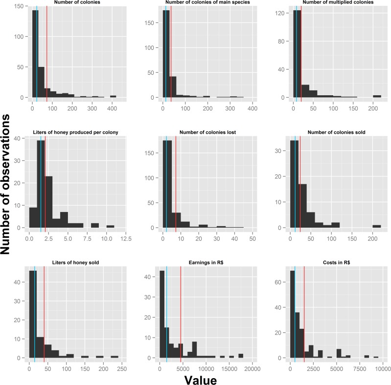
Fig 1. Histograms showing the frequency distribution of nine continuous indicators of productivity and income.
Red bars represent the means, while blue bars show the median values. Extreme values of some variables were excluded to improve clarity (see S3 Table for full summary statistics).

