
Figure 2.
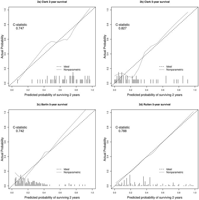
Calibration curves for all-stage models. The x-axis denotes the predicted probability of achieving the endpoint from the model. The y-axis denotes the observed probability of achieving the endpoint in the Mayo dataset. The dotted line is a smoothed fit of the mean model predicted probabilities vs. the mean actual probabilities over a window of predicted probabilities in the Mayo dataset. The dashed identity line denotes optimal calibration. The histogram at the bottom of the plot denotes frequencies of predicted probabilities when the model is fit to the Mayo dataset.
a) Clark overall survival at 2 years
b) Clark overall survival at 5 years
c) Barlin overall survival at 5 years
d) Rutten overall survival at 5 years