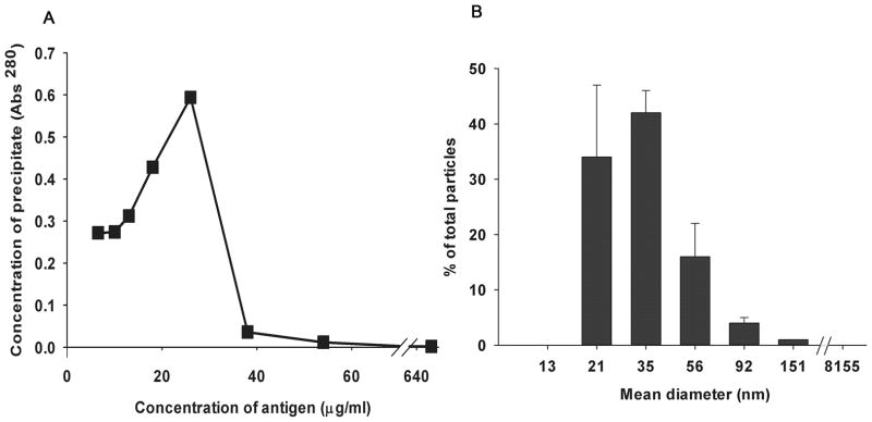
Figure 7. A. Quantitative precipitin curve.

The graph shows a quantitative precipitin curve plotting the protein concentrations of immune precipitates (pellets) from a series of tubes incubating increasing concentrations of antigen and a fixed concentration of antibody. The peak marks the POE. B. Particle size measurement. Particle size distribution of SIC prepared at a 15-fold antigen excess was measured using DLS; the data obtained with Dynapro software are presented here. The graph plots particle mean (±variance) diameter in nm on the X axis while the Y axis shows the % distribution of total particles calculated using the relative amount of particles (G(d)) at each size.
