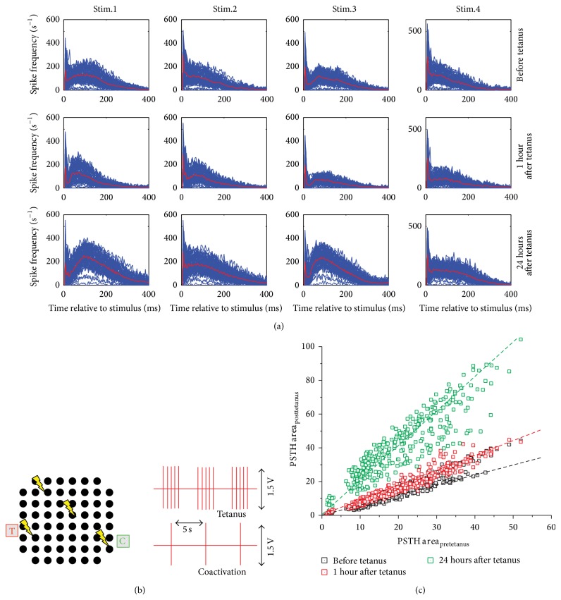
Figure 4.
(a) Superimposition of the PSTH curves (each per electrode). The thick red line indicates the average shape. Each row indicates a peculiar phase of the protocol: before the delivery of the tetanus (first row) and 1 hour (second row) and 24 hours (third row) after delivery of the tetanus. Each column indicates a different stimulation site. (b) Sketch of the tetanic protocol described in [20]. Each black dot represents a microelectrode. The yellow arrows indicate where the stimuli are delivered. The tetanic protocol consists of a high frequency tetanic stimulation coupled to a low-frequency (in-phase) stimulation. (c) Scatter plot of the PSTH area for each active electrode. Each point represents an active channel with a certain PSTH area during three phases of the protocol: before the delivery of the tetanus (black squares) and 1 hour (red squares) and 24 hours (green squares) after delivery of the tetanus. The dashed lines represent the linear fitting of the three scatter plots.

