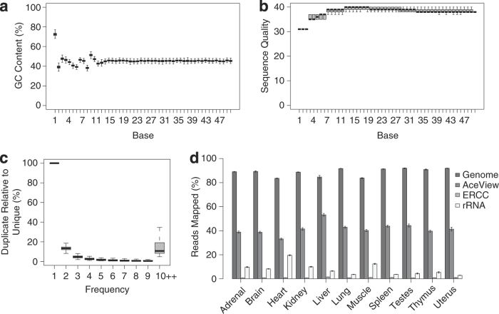
Figure 2. Quality assessment metrics for RNA-Seq data.
Box plots representing (a) GC content (%) and (b) Phred quality score distribution over all reads across all samples in each base (i.e., sequencing cycle). The box and horizontal bar represent the interquartile range and median of the (a) GC content and (b) median of Phred quality score over all reads. (c) Box plot representing the percentage of reads (y-axis) that appear N times (x-axis) relative to the number of unique reads from each sequencing sample across all samples. (d) The percentage of reads mapped (ratio, Mean ±s.e., n=32 in normal organs or 16 in sexual organs) to genomic regions, AceView exons, ERCCs and rRNA in each organ.

