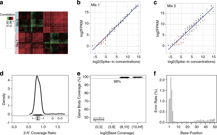
Figure 3. Quality assessment based on external RNA spike-in controls.
(a) Heatmap and hierarchical clustering representing Pearson correlation between expression profiles of external RNA spike-in controls (ERCC) in 318 samples. Mix1 (pink) and Mix2 (light blue) are marked at the row side bar. The order of samples is identical in rows and columns. The plots of log2(FPKM) (Mean ±s.e., n=159) of ERCCs detected from samples spiked with ERCC Mix1 (b) and Mix2 (c) vs log2(spike-in concentrations). Linear fitting curve (blue) and error bar (red) are marked. (d) Kernel density and box plot representing 3′/5′-end coverage ratio across all samples. The average coverage of the 50 bases at the 3′- and 5′-ends of the 20 ERCCs with the highest spike-in concentrations is used to represent the coverage of the 3′- and 5′-ends in each sample. (e) Box plot for the gene body coverage ratio based on the 20 ERCCs with the highest spike-in concentrations. Four bins of the x-axis represent for average per-base coverage for the 20 ERCC sequences in each sample. Y-axis represents gene body coverage ratio, i.e., the percentage of bases that are sequenced at least one time. (f) Bar plot for single nucleotide sequencing error rate (y-axis) of each base along 5′- to 3′-end of a read (x-axis).

