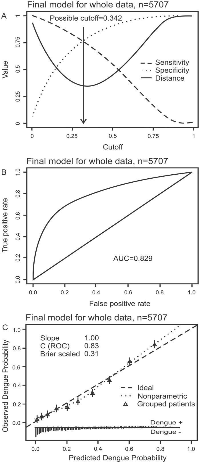
Fig 1. Performance of the Early Dengue Classifier (EDC) in all subjects.
Figure A displays possible sensitivity/specificity trade-offs for different cut-off values and the distance from the corresponding points on the ROC curve to the upper left corner (perfect model). Figure B displays the receiver operating characteristic (ROC) curve. Figure C is a calibration plot. It displays a scatterplot-smoother of predicted versus observed risks (dotted line), predicted versus observed risks for ten patient strata of equal size grouped according to predicted risks (triangles) and the ideal identity line (dashed line). The rugs at the bottom of the graphs characterize the distribution of predicted risks in true dengue and non-dengue cases, respectively.

