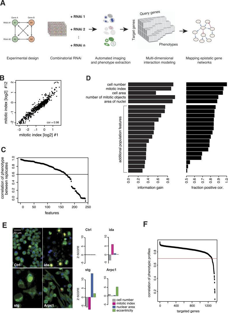
Figure 1. Combinatorial RNAi to map multi-phenotype genetic interactions.
(A) Workflow for multi-phenotype genetic interaction analysis by RNAi. (B) Reproducibility of phenotypic measurements. Plot shows replicate measurements for 1293 target genes at the beginning and end of the screening campaign. No batch effects on phenotypes were observed. (C) Each point in the plot corresponds to one of the phenotypic features. The y-axis shows the Pearson correlation coefficient of the feature's values between two replicates. Along the x-axis, features are ordered by their correlation coefficient. (D) Selection of non-redundant features proceeded step-wise, starting with cell number, mitotic index and cell area. In the left panel, the x-axis shows the information gain (as measured by the correlation of the residuals between replicates) for the selected features. Features are ordered as selected. In the right panel, the x-axis shows the fraction of positively correlated residual features remaining, which is used as a stop criterion (Laufer et al., 2013). (E) Representative image regions are shown for negative control (Ctrl), imaginal discs arrested (ida), string (stg) and actin-related protein 2/3 complex, subunit 1 (Arpc1). Bar charts display measured quantitative features. (F) Two independent dsRNA reagents per gene were used to assess on-target specificity. The plot shows the correlation coefficient (r) between the two reagents across all phenotypic features and 72 query dsRNAs. Only genes with r > 0.7 (red line) were included in further analyses.
Figure 1—figure supplement 1. Experimental design.


