. 2015 Mar 6;4:e05464. doi: 10.7554/eLife.05464

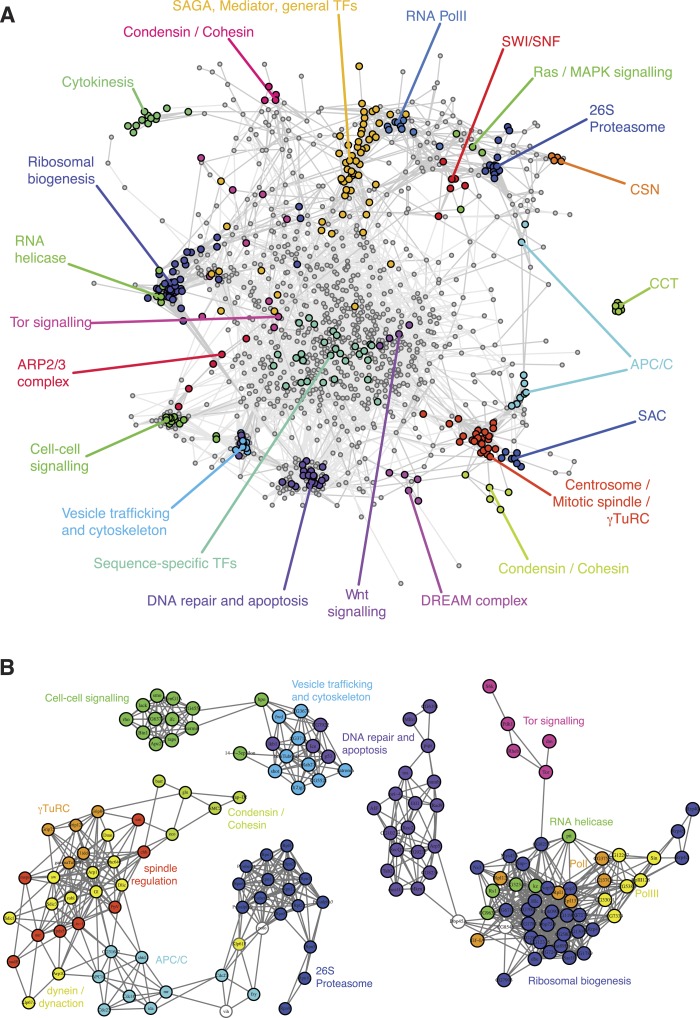
Figure 3. A landscape of statistical genetic interactions.

(A) Correlation network of genetic interaction profiles. Pearson correlation coefficients were computed for each pair of genes using the profile of all genetic interactions of these two genes to all other genes in all phenotypic features. An edge is drawn in the graph for each gene pair with correlation coefficient ≥0.6. Genes were placed by a graph layout algorithm (Fruchtermann–Reingold). Genes with similar genetic interaction profiles are proximal. The colour code depicts different biological processes that were separated by the correlation network. (B) Subgraphs of the correlation graph shown in Figure 2 highlight the wiring within and between the annotated complexes.

DOI: http://dx.doi.org/10.7554/eLife.05464.008

Figure 3.

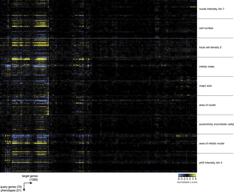
Figure 3—figure supplement 1. Heatmap of multi-parametric genetic interactions.

Figure 3—figure supplement 1.

Heatmap of all interaction coefficients between 1293 target genes and 72 query genes for nine of the phenotypic features. Blue colour indicates negative genetic interactions and yellow are positive genetic interactions.
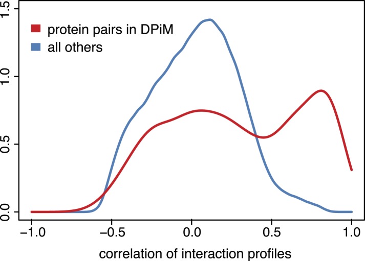
Figure 3—figure supplement 2. Genetic interaction profiles and protein complexes.

Figure 3—figure supplement 2.

Distribution of pairwise Pearson correlation coefficients across 21 phenotypes for gene pairs detected by co-purification and mass spectrometry according to the DPiM dataset (Guruharsha et al., 2011) (red line) and for all other gene pairs (blue line).