. 2015 Mar 3;4:e05166. doi: 10.7554/eLife.05166

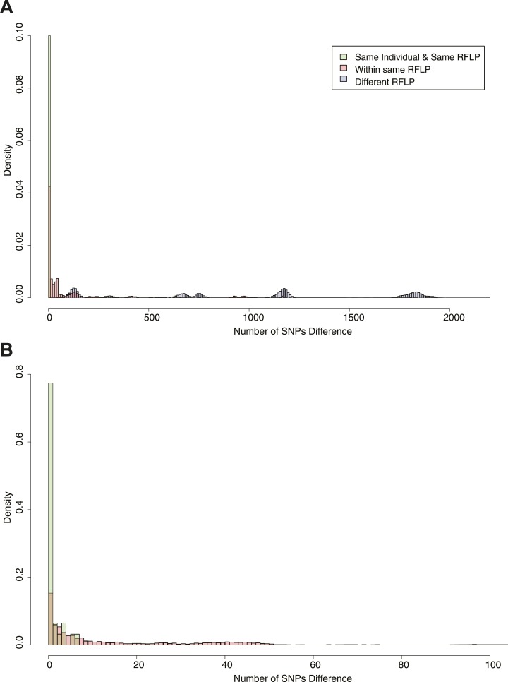
Figure 2. Pairwise SNP distances between all pairs of samples with known RFLP.

The y axis shows the relative frequency within each subgroup: same RFLP pattern (red), different RFLP patterns (blue); same individual, same RFLP (green). (A) shows the full data set, and (B) is part of the same figure drawn at a larger scale (each bar corresponds to 1 SNP) to show the smaller distances more clearly.

DOI: http://dx.doi.org/10.7554/eLife.05166.005

Figure 2.

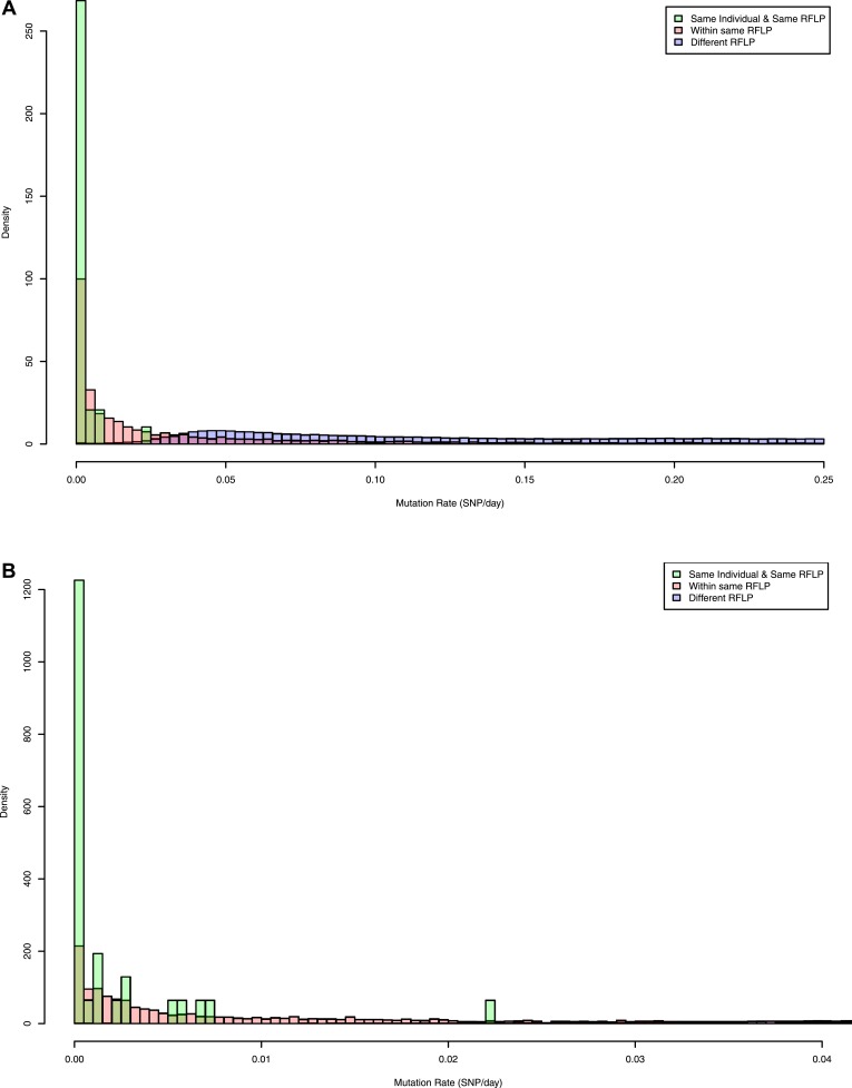
Figure 2—figure supplement 1. Pairwise mutation rates between all pairs of samples with known RFLP (calculated as number of SNPs/number of days between dates of disease onset between individuals).

Figure 2—figure supplement 1.

The y axis shows the relative frequency within each subgroup: same RFLP pattern (red), different RFLP patterns (blue); same individual, same RFLP (green). (A) shows the full data set, and (B) is part of the same figure drawn at a larger scale (each bar corresponds to 0.001 SNP/day) to show the smaller distances more clearly.