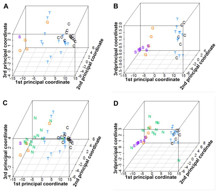
Figure 2.
PCA plots based on 39 probe sets reveal expression profile distances of individual samples within each experimental group. Panels A and B show the relative clustering of data points within the control, GPA, TED, and sarcoidosis groups in the discovery set (A) and validation (B). Panels C (discovery set) and D (validation set) reveal how NSOI samples are distributed with many in close proximity to the GPA samples. Rotatable views of the 3-dimensional plots in panels C and D are in online supplemental files.

