
Figure 6.
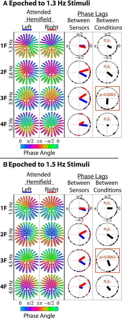
Topographical phase distributions of the entrainment response. A and B show the entrainment response to 1.3 and 1.5 Hz stimuli, respectively. In the first two columns of each panel, each point represents a sensor color coded by the average phase at the respective harmonic frequency. Phase values were first averaged across trials and then across participants, as described in the Materials and Methods. Only the attended responses are shown. Gray boxes in the background of each topography indicate the sensor groups that were analyzed. It was ensured that there was significant entrainment at all sensors and all harmonics (p < 0.001) before these phase analyses were conducted. In the third columns, phase lags between left and right sensor groups as a function of attended direction (blue = attend left; red = attend right). Points along the circumference of each plot represent single-subject phase lags. The direction of bars emanating from the plot origins represent average interhemispheric phase lags across subjects and the length of these bars indicates phase consistency. The fourth columns are phase lags (of the interhemispheric phase lags) between attended hemifields. Orange boxes denote significant differences from 0 (Bonferroni-corrected).