
Figure 1. Hot spot positioning and intensity.
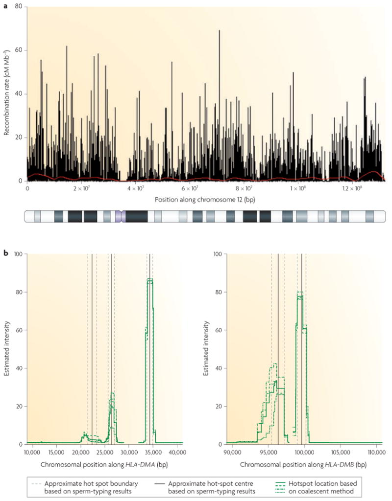
a | Recombination rate variation along human chromosome 12. The graph shows the recombination rate estimated from a genome-wide survey of genetic variation (black bars) and estimated recombination rates from the deCODE genetic map (red line). Recombination hot spots are evident as black spikes surrounded by regions of low or no recombination. Underneath the graph is a cytological banding map of the chromosome. Note the lack of recombination activity near the centromere (purple), b | Estimated locations and intensities of several hot spots in the human major histocompatibility complex (MHC) region inferred by coalescent-based statistical methods (left panel, human leukocyte antigen (HLA)-DMA; right panel, HLA-DMB). Positions along the x-axis are in base pairs according to the consensus map of the human MHC13 The green lines show estimates from the coalescent method22, and the vertical black lines and dashed grey lines show the approximate hot spot centre and the approximate hot spot boundaries, respectively, as estimated from sperm-typing results13. Part a is modified, with permission, from REF. 24 © (2005) American Association for the Advancement of Science. Part b is reproduced, with permission, from Nature Genetics REF. 22