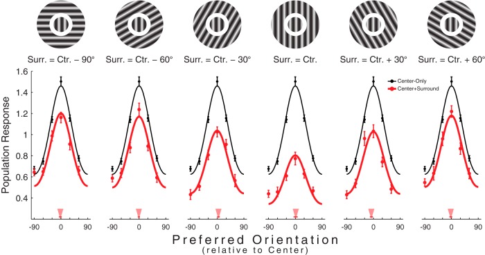
Figure 2.
Scaling of population responses. Population responses under each of the six relative center/surround configurations (a stimulus exemplifying the relevant configuration is illustrated above each subplot). Data points indicate mean ± SEM. Smooth black curves indicate the circular Gaussian fit to the center-only population response. Smooth red curves indicate the center-only Gaussian, scaled to best fit the center+surround data depicted in red. Red triangles point to the orientations of the mean vectors calculated from the center+surround population responses. The thin red lines superimposed on the triangles indicate the 95% confidence intervals obtained from the bootstrapping procedure described in the main text. Stimuli are shown for illustration and are not to scale.

