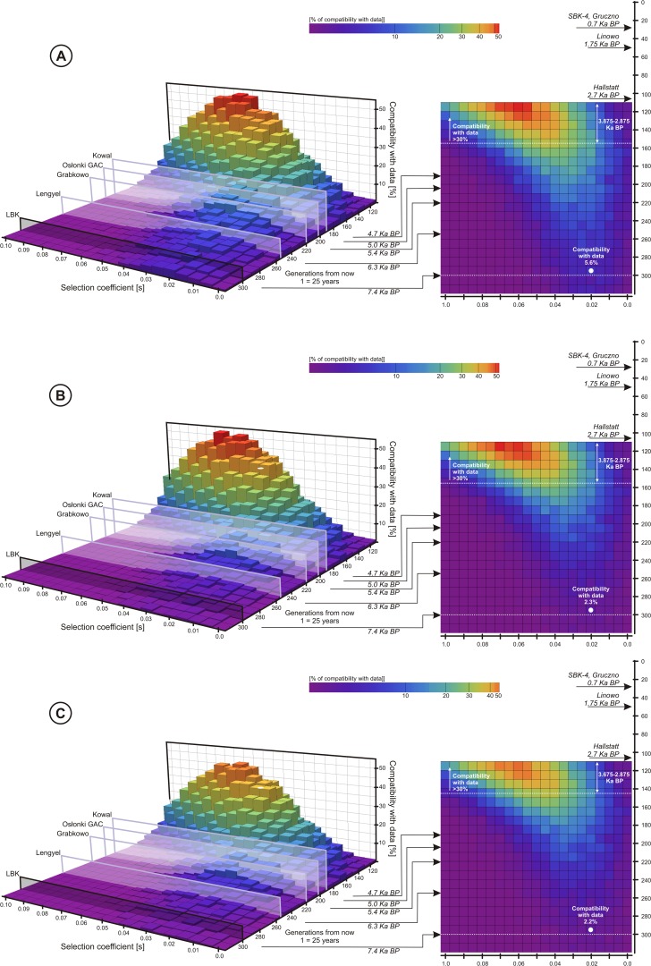
Fig 2. Each 3D plot together with its 2D projection presents probability of a scenario with given selection coefficient and the T allele introduction time, assuming variable population size (see S1 Fig. for the shape of the size curve).
The height/color of each bar represents the percentage of Wright-Fisher curves (number per 1000) falling into appropriate confidence intervals shown in Table 2: A—the T allele, B—LP, C—the T allele and LP jointly.

