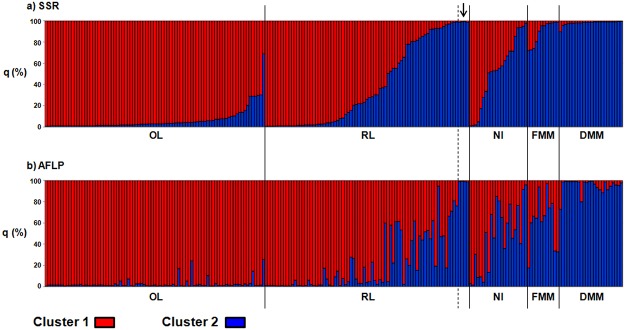
Fig 2. Population structure at individual level.

Percentages of membership to cluster 1 (q1, red) and cluster 2 (q2, blue) for each of the 218 genotypes for the SSR (a) and AFLP (b) molecular markers. Each genotype is represented by a vertical bar divided into two coloured segments, the lengths of which indicate the proportions of the genome attributed to cluster 1 and cluster 2. The arrow indicates the four genotypes of the control accession ANGRMC13.
