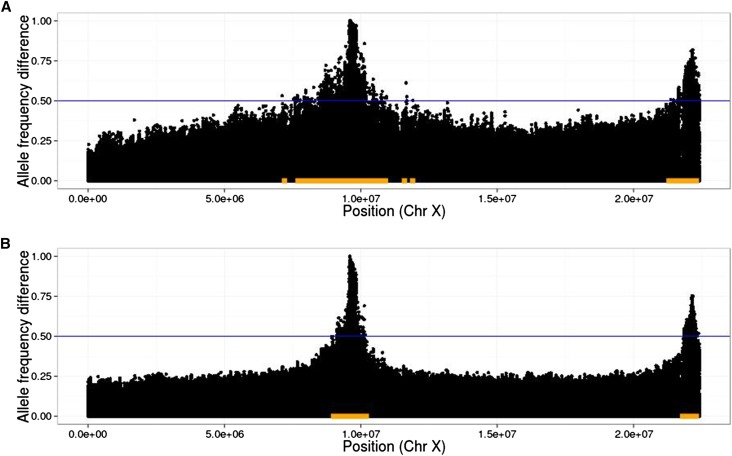
Figure 2.
Illustration of linkage disequilibrium between QTL and neutral loci. In plots of allele frequency differences between high and low populations, QTL peaks are narrower when extra generations of neutral mixing are introduced. As an example, we indicate a threshold of 0.5 with the blue lines and the corresponding detection regions with orange bars. Note that the true region, consisting of sites within 10 kb of either SNP, is too small to be seen at this scale; thus, the size of the orange bars represents the (local) false-positive rate at this threshold. Also note that the threshold of 0.5 was chosen for the purpose of illustrating the detection region, and in practice a much higher threshold will typically be chosen (10 QTL, , N = 1000, selected, 20 generations of initial mixing, shown are average D values over 20 replicates). (A) Twenty generations of selection; (B) 20 generations of selection, 4 generations per selection event (80 generations total).

