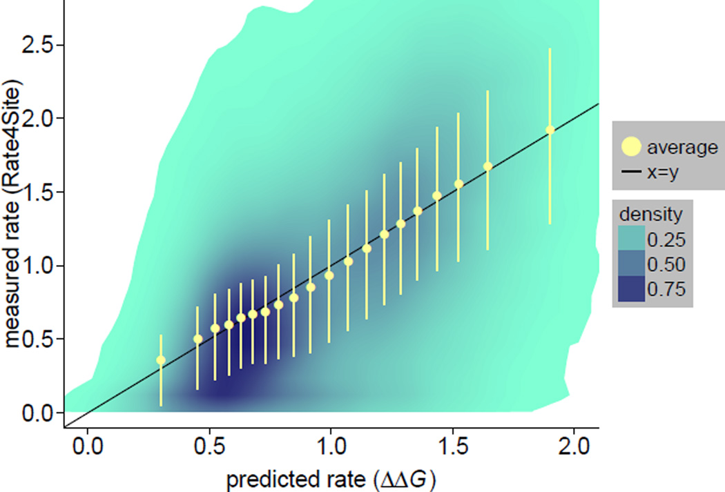
Figure 2.
The relationship between rates predicted from ΔΔG and rates inferred by Rate4Site is nearly linear. The joint distribution of empirical vs. predicted rates is shown using shaded areas. All sites were grouped into 20 bins of approximately equal number of sites using quantile breaks on the predicted rate axis. Yellow dots are the mean rates obtained by averaging over sites within a bin. Yellow error bars correspond to the 25% and 75% quantiles for each bin. Average empirical rates (yellow circles) are very close to the x = y line that corresponds to a perfect empirical-predicted fit (the correlation coeffient between mean empirical and predicted rates is 0.995). However, there is substantial variation around the mean trend, as can be seen from shaded areas and yellow error bars (correlation between non-averaged empirical and predicted rates is 0.558).

