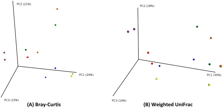
Fig 4. PCoA plots (by patient).
PCoA plot showing good clustering of pairs of samples originating from the same patient. Points in three-dimensional space represent samples, each colored according to the patient. Each patient has two samples. (PCoA of Bray-Curtis distances on the left; PCoA of Weighted UniFrac distances on the right).

