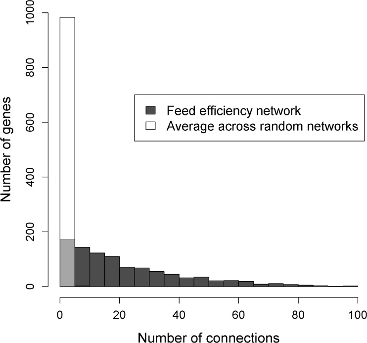
Fig 3. Topological comparison between the feed efficiency network and 10 randomly generated networks.
The figure illustrates the number of connections per gene in the feed efficiency network and the average number of connections per gene across the ten random networks. Due to the transparent style of the white bars, black bars or parts of black bars that are hidden by a white bar are colored in light grey.

