
Figure 3.
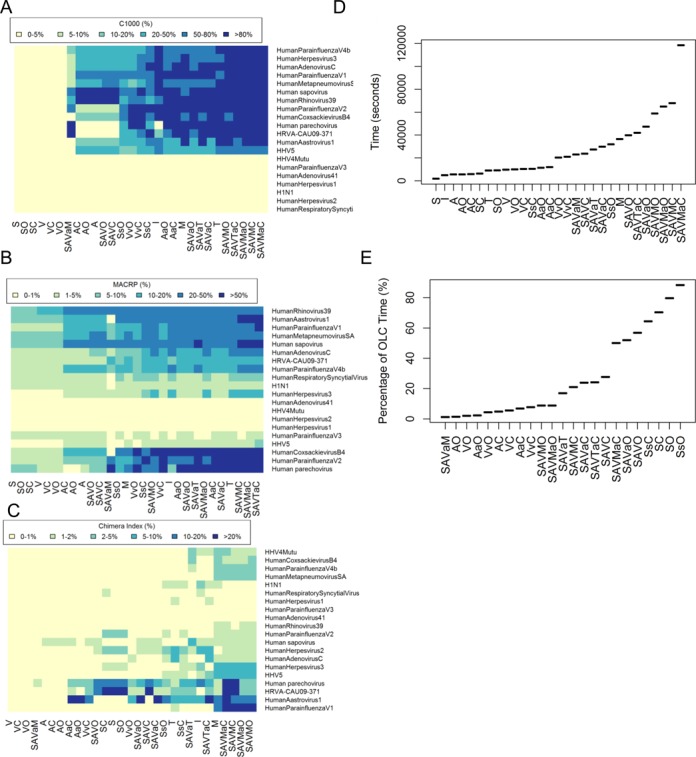
Comparison of different assembly strategies using the ‘pooled virus standard’ dataset: (A) C1000 for each assembler; (B) MACRP for each assembler; (C) chimera index as a heatmap; (D) execution time; and (E) percentage of execution time on the OLC step. All boxplot figures were ordered by average values on the y-axis.