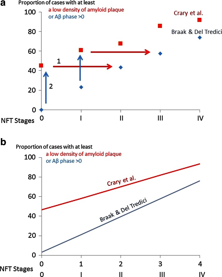
Fig. 2.
Linear relationship between the NFT stage and the proportion of cases with Aβ pathology. a Raw data from Crary et al. [8] (red squares) and Braak and Del Tredici [5] (blue diamonds). The red squares indicate the percentage of cases with ‘low,’ ‘moderate,’ or ‘high’ amyloid plaque score. The blue diamonds indicate the percentage of cases with Aβ phases 1, 2, 3, 4 or 5. Red squares and blue diamonds thus refer to the cases with Aβ deposition, whatever its severity. The blue arrows indicate the translation along the Y axis that should be applied to Braak and Del Tredici data [5] so that they coincide with the Crary et al. data [8]. The red arrows indicate, alternatively, the translation that should be applied along the X axis so that the Crary et al. data [8] coincide with Braak and Del Tredici data [5] (see text for explanation). b Regression line between the NFT stages and the proportion of cases with Aβ pathology. To compute the correlation coefficient, the slope and the intercept of the regression lines, the NFT stages (I to IV) had to be translated into numerical value (1–4). Equation of the red line (data from Crary et al. [8]): Proportion of cases (in percentage) with low, moderate or high plaque score = 11.78 × NFT stage + 46.5. The correlation coefficient r = 0.99 indicates that the NFT value suffices to predict with a high degree of accuracy the proportion of cases with Aβ pathology. Equation of the blue line (data from Braak and Del Tredici) [5]: Proportion of cases (in percentage) with Aβ phase higher than 0 = 18.21 × NFT stage + 3.11. The correlation coefficient r = 0.995 indicates that the NFT stages almost fully predicts the proportion of cases with Aβ pathology

