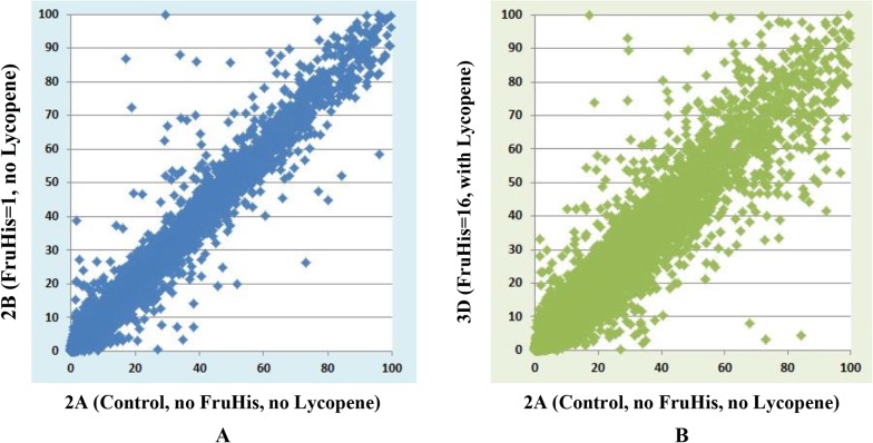
Fig 7. Two gene expression plots in the second data set.
These plots are for comparisons between 2A and 2B, between 2A and 3D. The x-axis represents 2A (Control, no FruHis, no Lycopene) and the y-axis represents 2B (FruHis = 1, no Lycopene) in A and 3D (FruHis = 16, with Lycopene) in B. We used gene expression values calculated by MULTICOM-MAP to make the plots. The range of these values was constrained to [0, 100] while keeping the original ratios in order to make these figures readable.

