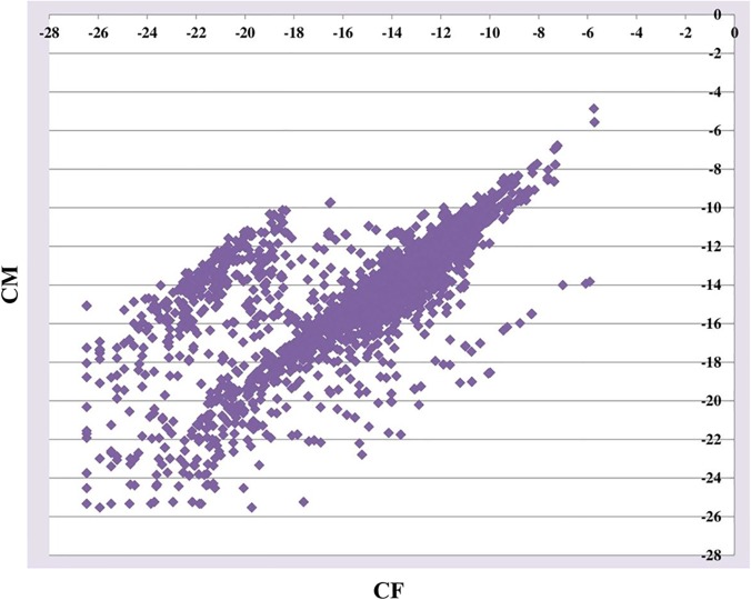
Fig 8. One gene expression plot in the third data set.
The plot is for the comparison between CF and CM. The x-axis represents CF and the y-axis represents CM. We used gene expression values calculated by MULTICOM-MAP to make the plot. The raw counts were transformed by log2 in order to make the figure readable.

