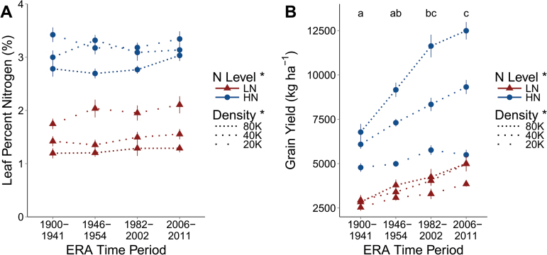
Fig. 2.
Leaf percentage nitrogen (A) and grain yield on a per area basis (B) are presented. Dotted lines represent planting density, with gaps between dots being proportional to differences in densities, with 20K, 40K, and 80K being 20 000, 40 000, and 80 000 plants ha–1. Triangles are in low nitrogen (LN) and circles in high nitrogen (HN). Points represent the mean of the four varieties in that Era time period in the specific N and density combination and vertical lines the standard error. For grain yield, letters demonstrate groupings from Tukey HSD mean comparisons among Era time periods. Presence or absence of an asterisk next to a treatment in the key indicates whether a treatment effect is significant or not, respectively.

