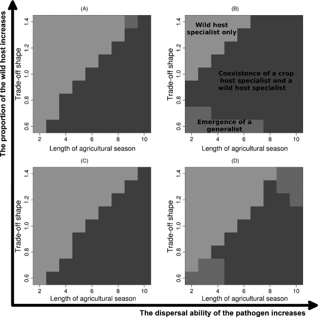
Figure 5.
Patterns of pathogen diversity. The different plots represent different conditions in the proportion covered by the wild host and the pathogen dispersal ability: (A) high proportion of wild host (q = 10%) and low pathogen dispersal (distMP = 2.5%); (B) high proportion of wild host (q = 10%) and high pathogen dispersal (distMP = 25%); (C) low proportion of wild host (q = 2.5%) and low pathogen dispersal (distMP = 2.5%); and (D) low proportion of wild host (q = 2.5%) and high pathogen dispersal (distMP = 25%). These graphs represent the prediction of multinomial logistic regression models fitted to the simulated data set.

