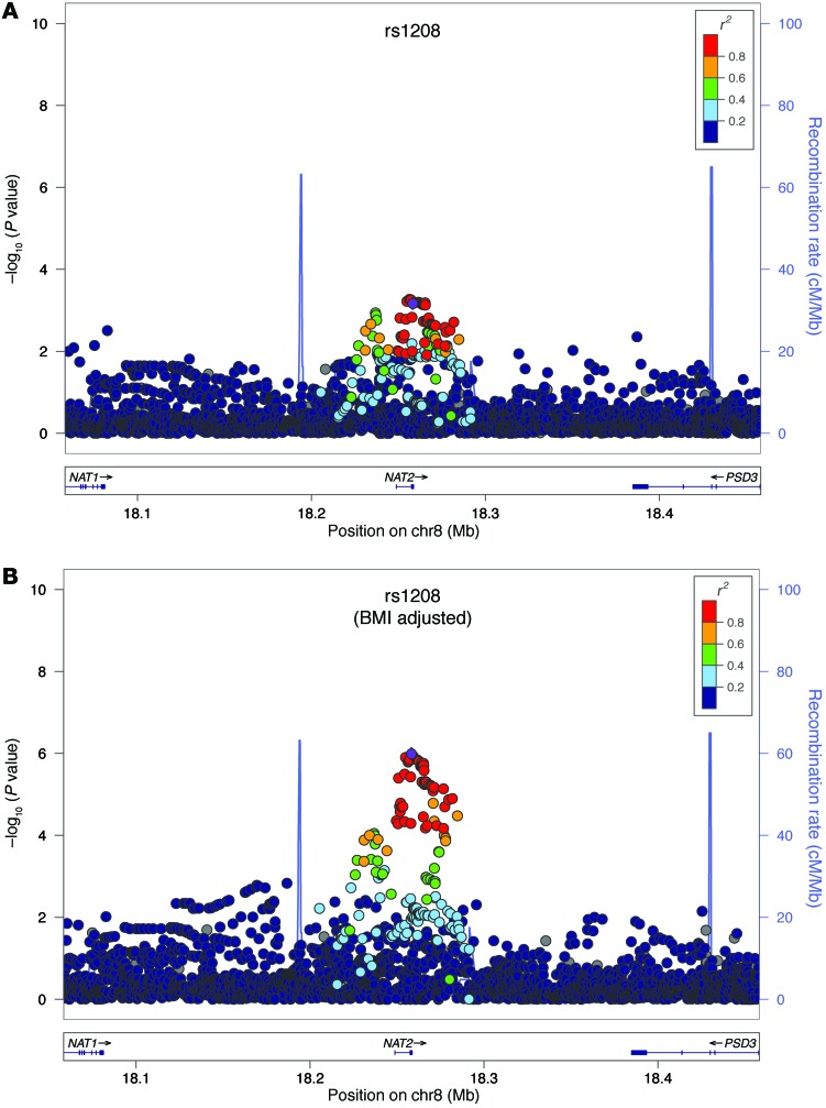
Figure 2. Regional association plots for NAT2.
Regional association plots for NAT2 (A) in age- and gender-adjusted analyses and (B) age-, gender-, and BMI-adjusted analyses. The –log10 of P values of the imputed SNPs are plotted on the y axis against genomic position (Hg19) on the x axis. Purple diamonds represent the top signal. Estimated recombination rates (taken from HapMap) are plotted to reflect the local linkage disequilibrium structure around the associated SNPs and their correlated proxies (according to a blue-to-red scale from r2 = 0 to r2 = 1, based on pairwise r2 values from Hg19/1000 Genomes).

