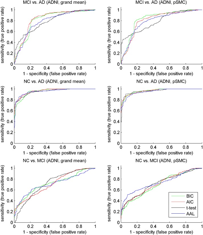
Fig 5. ROC curve of compared method on ADNI dataset.
To plot the curve, we collected the predicted probabilities for all the test sets in 10 times 10-fold cross-validation, along with their true class labels. For the plotting of ROC curves, we refer to page 173 of the book by Witten et al. [42].

