
Figure 6.
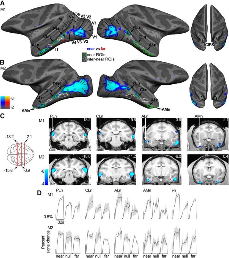
Near disparity-biased activity. Computationally inflated surfaces for Monkey M1 (A) and Monkey M2 (B) showing those voxels that responded more to near stimuli in blue/cyan (near disparity-biased) and those voxels that responded more to far stimuli in yellow/red (none visible). The surface activity is based on half the data from Experiment 2; the other half was used to define the near disparity-biased disparity regions. Left, Lateral views of each hemisphere. Right, Top views of the brain. Black solid lines indicate horizontal meridians. Black dotted lines indicate vertical meridians. Green closed contours represent the near disparity-biased disparity patches in each hemisphere. PLn, Posterolateral; CLn, centrolateral; ALn, anterolateral; AMn, anteromedial near disparity-biased region. White dotted closed contours represent the interstitial regions (i–n), located adjacent to the near disparity-biased regions. C, Panels showing near disparity-biased activation in coronal slices at locations indicated by the red lines on the top-down view of the brain schematic (or nearby for M2). First row, Monkey M1. Second row, Monkey M2. Slices are given in Talairach coordinates (mm). Functional activity on the slices is based on all data from Experiment 2 and superimposed on a high-resolution anatomical scan. D, Time course of the average percentage signal change in the PLn, CLn, ALn, AMn, and i-n regions for the near, null, and far stimuli based on half the data from Experiment 2. The average time courses of the different regions are scaled to be of approximately the same height for proper comparison. Black scale bar on the left of each panel corresponds to 0.5% signal change; note the different lengths. Blocks lasted 32 s. Shading over the lines indicates SEM.