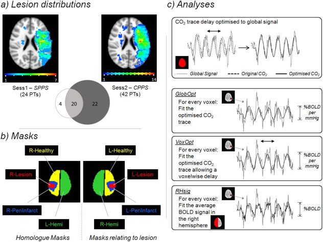
Figure 1.

(a) Lesion Distributions. The spatial distribution of the patient's acute infarct lesions is shown for both the Sub‐acute Phase Post‐Stroke (SPPS also referred to as Sess1) and Chronic Phase Post‐Stroke (CPPS also referred to as Sess2) time points. The colour‐code of each voxel indicates how many patients had a lesion that included that voxel. The Venn diagram shows how many patients were scanned at each time point and the overlap between them. (b) Masks. The schematic shows the masks used in the analysis. (c) Analyses. The delay of each participant's end‐tidal CO2 trace was initially optimised by aligning it to the corresponding global BOLD signal time series. Three subsequent analyses types were performed. GlobOpt: the optimised CO2 trace was fitted to each voxel's time series using a GLM. VoxOpt: the same CO2 trace was fitted to the voxel's time series but was allowed to vary temporally to optimise the fit. RHsig: the average BOLD time series signal from the right hemisphere was fitted to the time series of every voxel in the brain. [Color figure can be viewed in the online issue, which is available at http://wileyonlinelibrary.com.]
