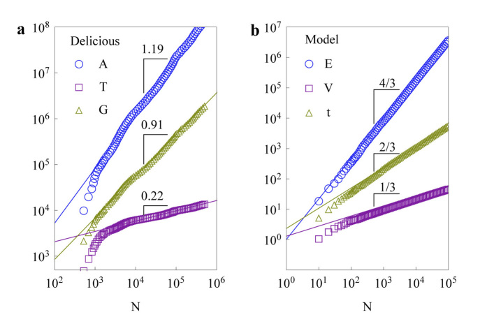
Figure 2. The scaling behaviours of the Delicious community (a) and the model (b).
In (a), the scalings represent the cumulative number of activities
 (blue circles), the total time elapsed
 (for convenience of comparison on the plot; filled purple squares), and the cumulative number of tags used by users
 (yellow triangles) versus the cumulative number of users of the Delicious community from Feb 1, 2003 to Nov 8, 2006. The solid lines represent the best fits. In (b), the scalings represent
 (blue circles),
 (filled purple squares), and
 (yellow triangles) versus
 of the basic model
 . The solid lines are theoretical predictions of the mean-field approximations (see Supplementary Information Section 1), in all simulations
 . We also provide the Flickr munity and the APS citation network as other empirical evidence in Supplementary Information Figure S7 and S8.

