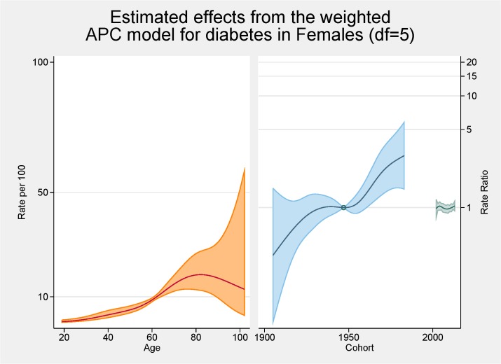
Fig 8. Multivariable APC-analysis of diabetes for females per 100 2002–2013, shown as line graphs representing rates (%) and rate ratios (log scale), with its 95% confidence interval (shaded area).
The left line is the estimated age effect, the middle line refers to the estimated birth cohort effect and the short line to the right refers to the estimated period effect.

