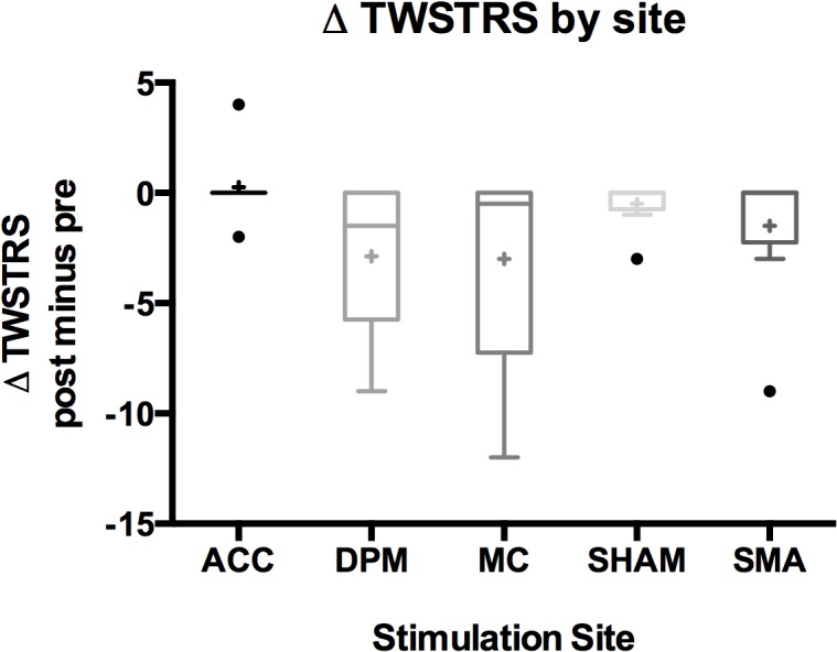
Fig 3. Boxplots of change in TWSTRS severity score by stimulation site showing greatest improvement over dPM and MC.

A box in the boxplot represents first quartile to the third quartile with the median as the centerline. The outliers are represented by circles and the mean value as a cross. Note that the ACC boxplot is collapsed since the first quartile is equal to the third quartile.
