
Fig 7. Impact of qPCR data on the determination of the nearest neighbors in UA samples.
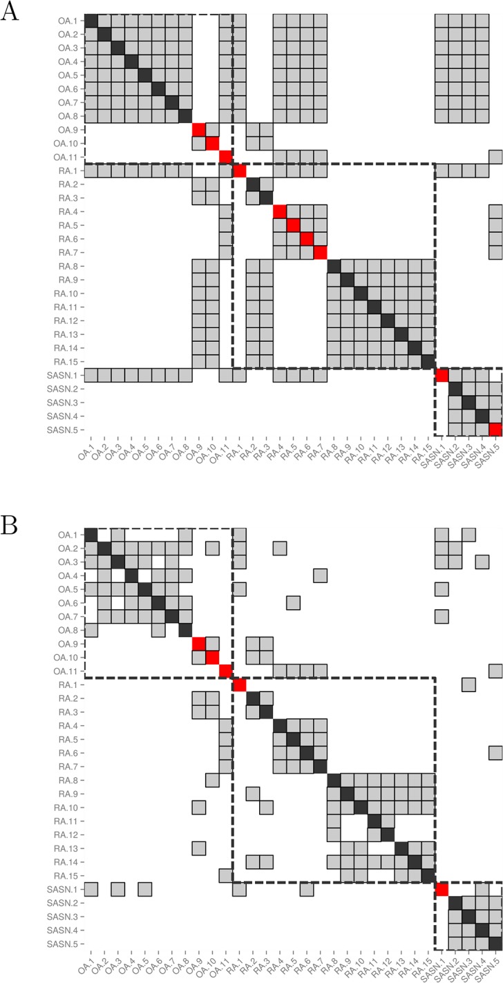
Both matrices show the nearest neighbors of each biopsy sample from the cohort of patients with UA, for whom qPCR data are available (n = 31). Each sample is represented by a column, and its nearest neighbors are greyed out in that column. The cell on the diagonal is red if the sample is misclassified and black otherwise. Samples from patients with the same diagnosis are surrounded by a dashed square. (A) Nearest neighbors are determined using only clinical data (ρ = 1). More than 5 nearest neighbors are displayed for each sample due to the presence of ties. (B) Nearest neighbors are determined using a combination of clinical and qPCR data (ρ = 0.2), demonstrating the tie-breaking effect of the qPCR data.