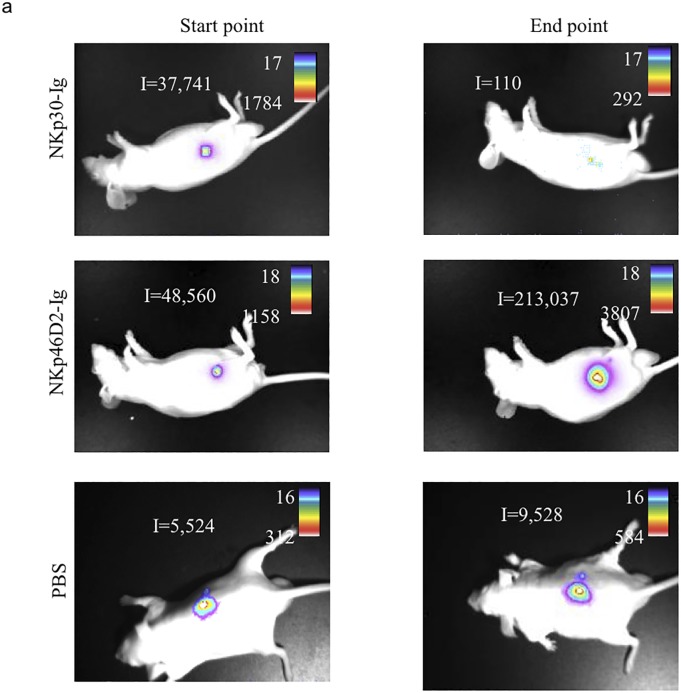
Fig 4. Summary of fusion protein treatment.
(a) Visualization of tumor progression and distribution in vivo. The figure shows an image visualization of one representative animal of each treatment. The scale on the right of each figure describes the color map of the photon count. The integrated light emission (‘I’) is indicated in the left of each photo. (b) Summary of treatment effect. Table describes the overall effect of treatments, as shown in details in Fig 3.

