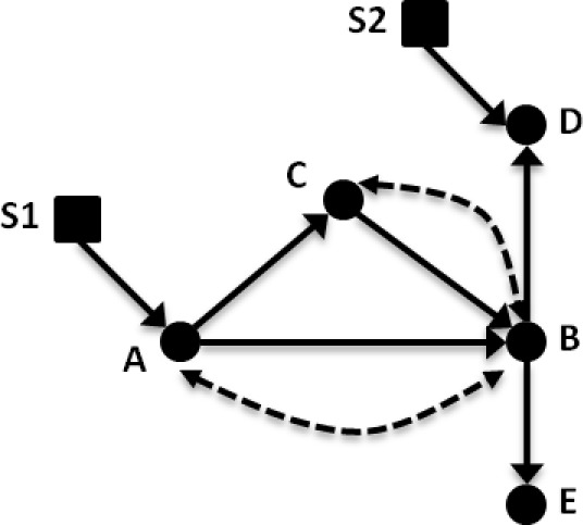
Figure 1.

Example causal diagram for lung cancer treatment. Variables: (A) treatment; (B) tumor progression; (C) tumor biopsy gene expression; (D) clinical history; and (E) CT imaging findings. In this causal diagram, solid circles represent standard variables (such as in a Bayesian belief network), and solid arrows between these nodes represent causal relationships. Dashed arrows/arcs indicate confounding influences between two variables that may exist when considering other populations. Selection nodes, shown as squares, provide a means to sub-select or filter a given variable so that the evidence is comparable between two groups.
