
Figure 2.
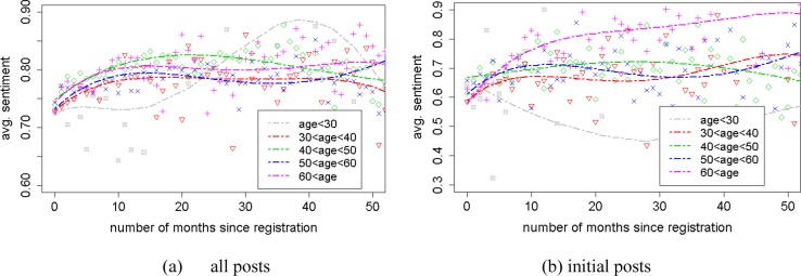
Sentiment changes by length of membership at the time of posting for different age groups, for (a) all posts and (b) initial posts. A colored point at (x, y) in the graph represents that the average sentiment score of all posts (a) or initial posts (b) published by users in corresponding age group in the xth month after their registration is y. Polynomial curves fitting each group were drawn for the sake of visualization.