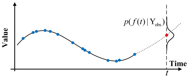
Figure 9.

Graphical illustration of the prediction problem on a GP model on irregularly sampled time series data. The solid line denotes the GP we learned from the data and the dotted line indicates the GP’s predictions of future values for future time t. The posterior distribution of f(t) at time t is shown and the red dot is the mean of that distribution, which is the value predicted by the GP.
