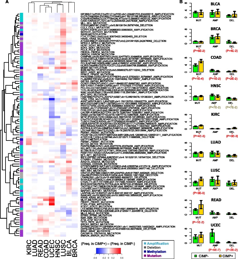
Figure 6.

Frequency of SFE occurrence in CIMP+ vs. CIMP− samples from TCGA. (A) The heat map shows frequency of occurrence in CIMP+ samples minus frequency in CIMP- samples for the top 100 SFEs with the greatest absolute variation across cancer types. Each row corresponds to a SFE and each column corresponds to a different cancer type. The color side bar shows the category associated to each SFE (amplification, deletion, mutation or methylation event). (B) Average number of mutations, amplifications and deletions per sample in different types of cancer. Error bars show 95% confidence intervals. Reported P-values were computed using a one sided t-test.
