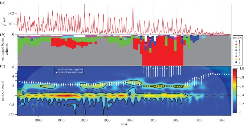
Figure 9.
Comparison of predicted versus observed measles dynamics in NYC from 1891 to 1984. (a) Square root of measles case reports, normalized by total concurrent population. (b) Approximate volumes of basins of attraction near the observed NYC measles incidence for each year from 1891 to 1984. For each year, we display the proportion of 10 000 simulations that reach each period. See §4 for details. (c) Colour depth plot of a continuous wavelet transform of the square root of normalized observed NYC measles cases (colour warmth scales with spectral power and 95% significance contours are shown in black). The predicted attractor and transient periods are overlaid (only the periods of annual and biennial attractor transients are short enough to appear on this graph and to be observable). Unfilled black circles indicate predicted attractor periods that are consistent with the observed data.

