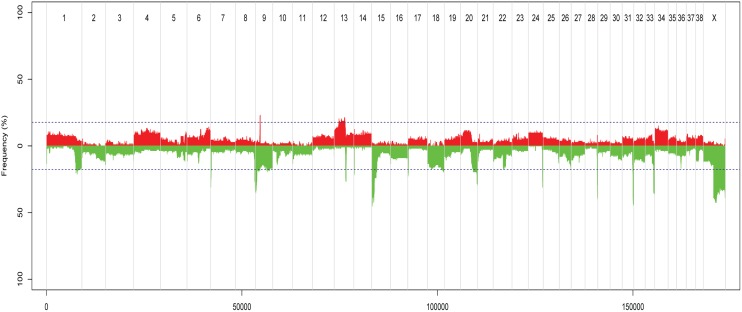
Fig 3. Recurring gains and losses across all tumour samples, according to ASCAT analysis.
The figure shows recurring gains and losses across all tumour samples, relative to the ASCAT-estimate of ploidy for each tumour. Red = gains, green = losses, chromosome number along the x-axis, and frequency of tumours with aberration on the y-axis. Peaks outside the dotted blue lines are aberrations found in 20 or more samples.

