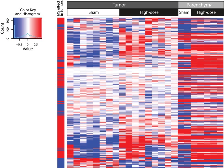
Figure 2.
Two-dimensional hierarchical cluster of genes that were expressed in a different manner in tumor compared to surrounding, non-tumorous parenchyma following MS-300 exposure. Columns represent mRNA samples from different tissues and exposures as indicated in the label above the heatmap. Expression values of every gene (rows) are centered by their mean across all tumor samples. The column on the far left denotes the increase (red) or decrease (blue) in fold change in the tumor tissue in response to MS exposure. This heatmap was generated by using the hclust function in the “stats” R package with complete agglomeration and Euclidean distance metrics.

