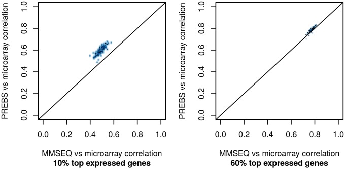
Fig 2. Absolute gene expression correlation scatter plots (RPA mode).
The plots show the comparison of correlations of PREBS vs microarray and MMSEQ vs microarray for all of the samples in the LAML data set. Each point represents one sample. Two different percentages of top expressed genes are taken: (a) 10%, (b) 60%.

