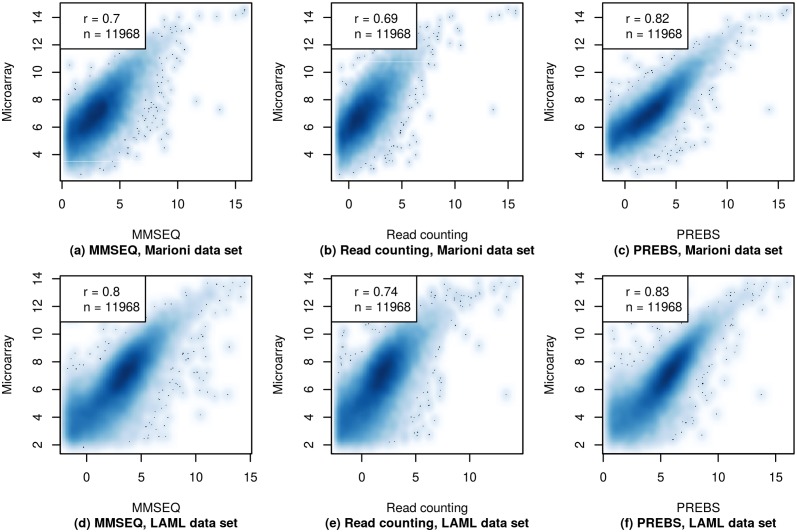
Fig 3. Absolute gene expression scatter plots (RPA mode).
The gene expression values from three different RNA-seq data processing methods (MMSEQ, read counting and PREBS) are plotted against gene expression values from microarray. Only plots for a single sample in each data set are shown. The top row shows results for the kidney sample from the Marioni et al. data set and the bottom row for the 2803 sample from the LAML data set. The figures show 60% of most highly expressed genes. The legend contains Pearson correlation (r) and the number of genes (n).

