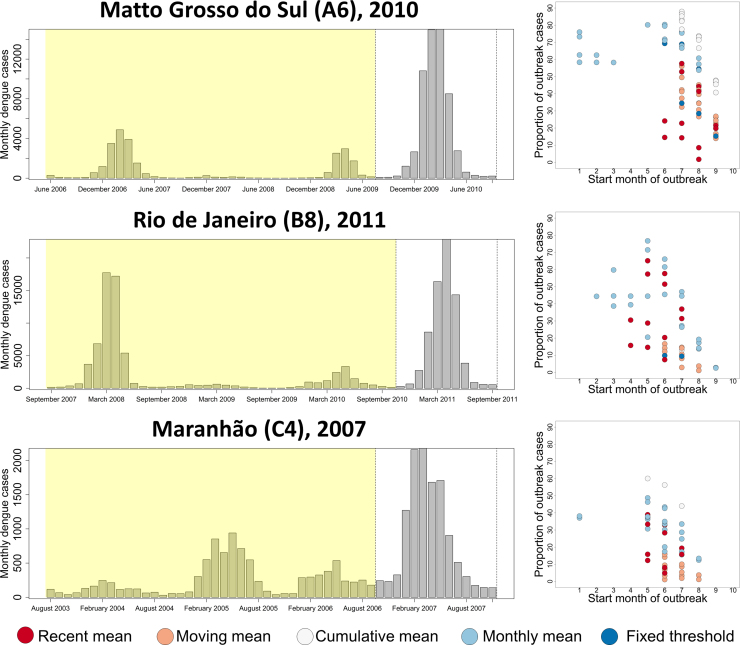
Fig. 5.
The difference in time of onset and overall outbreak size for different outbreak definitions applied to different example outbreaks. The longitudinal plot (left) shows the monthly reported case number in the four years (shaded yellow) building up to an extra-seasonal surge in cases (unshaded) in three different states with differing DENV transmission dynamics. For each outbreak, the graph on the right shows the variability in timeliness of detection (number of months since outbreak onset, x-axis) and outbreak size as a proportion of total cases (y-axis) when fitted to data in the yellow shaded region and applied to the unshaded region. Only definitions that identified an outbreak are shown.

