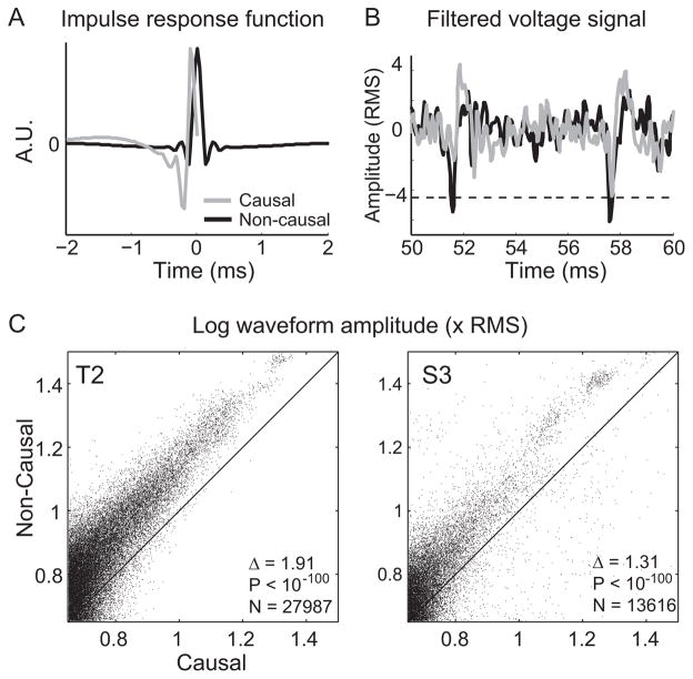
Fig. 1.
Causal and non-causal filtering. (A) The shape of the causal filter (gray curve) and the non-causal filter (black curve). Both filters are 4th order bandpass (250–5000 Hz) Butterworth filters. The non-causal filter is more localized than the causal filter (i.e. the amplitude of the non-causal filter is significantly different from zero for a much shorter duration than the causal filter), and might be better matched to the shape of a typical action potential. (B) Example of 10 ms of continuous signal filtered causally (gray curve) and non-causally (black curve). The non-causal filter accentuates the amplitude of putative spiking events, allowing them to cross threshold (dashed black line, set at −4.5 × RMS). (C) Scatter plot of the amplitude (relative to the RMS of the signal) of threshold crossing events using the causal filter (x-axis) versus using the non-causal filter (y-axis) for participant T2. Each dot represents one spiking event. A maximum of 100 spiking events were used per channel per session. Amplitudes are plotted on a log10 scale. Δ gives the mean pairwise difference between the amplitude of causal and non-causal spiking events. Fewer than 0.3% of points fall outside the plot window. (D) Same as (C), except for participant S3. Fewer than 0.1% of points fall outside the plot window.

