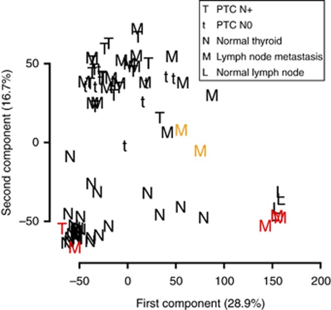
Figure 1.
Principal component analysis of the data set. Samples are projected on the two first components, which explain 28.9% and 16.7% of the total variance of the data set, respectively. Red denotes mislabelled samples. Orange denotes samples with high lymphoid tissue contamination (see Figure 4A).

