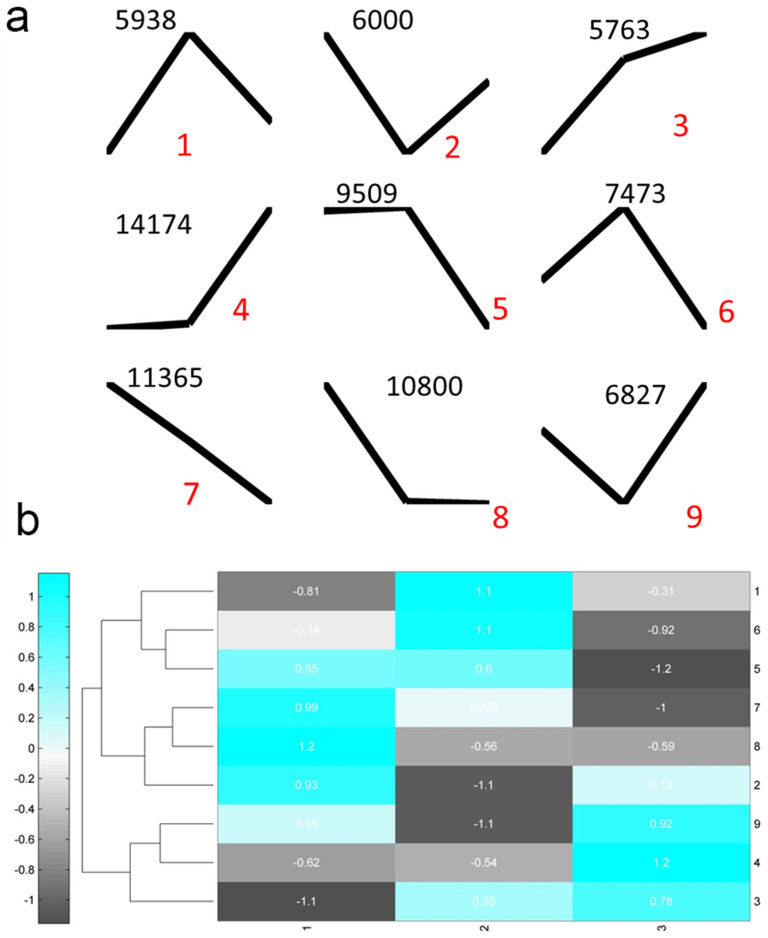
Figure 4. K-Means clustering of gene expression profiles.
(a), the centroids of nine clusters with different expression patterns. Numbers on the top are the number of genes for each cluster; and red numbers are cluster labels. (b), a heat map plot of nine clusters display the relative expression levels of centroids. Numbers on the right are corresponding to cluster labels in (a).

