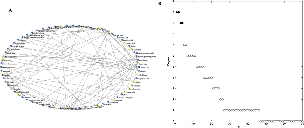
Fig. 3.
Analysis of the metabolic correlation network based on the identified plasma metabolites. (A) Metabolic correlation network based on 70 identified plasma metabolites, containing 79 edges (T = 0.6). Yellow nodes represented the significantly altered metabolites between patients and controls (P < 0.05). (B) The values of degree of 70 nodes in descending order. Filled circles represent the top highly connected metabolites in the network. (For interpretation of the references to color in this figure legend, the reader is referred to the web version of this article.)

