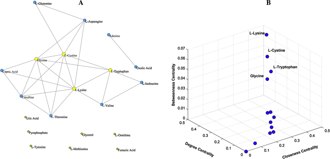
Fig. 4.
Analysis of the metabolic correlation network based on significantly altered metabolites between young hypertensive men and healthy controls. (A) Metabolic correlation network based on 20 significantly altered metabolites (P < 0.05), containing 26 edges (T = 0.6). Yellow nodes represented hub metabolites of the network. (B) Three-dimensional diagram of three centrality indices for the 20 nodes of the network, including betweenness centrality, closeness centrality and degree centrality. (For interpretation of the references to color in this figure legend, the reader is referred to the web version of this article.)

